
Beyond the Logo: Aligning Physical Signage, Digital Touchpoints, and Corporate Identity
Many Malaysian SMEs operate under a common misconception: they believe that investing in a logo design completes their corporate branding.
A business might commission a polished logo, yet display faded, mismatched acrylic lettering above its retail outlet, hand out cluttered name cards with misaligned typefaces, and direct clients to a dated, non-responsive website.
A logo is simply an identifier. Brand identity, by contrast, represents the entire ecosystem of sensory and visual signals a company sends to the market. When physical touchpoints and digital platforms communicate conflicting messages, potential clients perceive inconsistency, eroding credibility before the first consultation even begins.
The Cost of the “Disconnected Brand”In business-to-business (B2B) engagements and high-value consumer decisions, trust is built through perceived competence. Inconsistency introduces friction into that equation: The Retail & Facade Disconnect: A company claims to be an innovative industry leader online, yet its physical signboard uses generic fonts, mismatched corporate colors, or poorly scaled vector graphics.
The Print & Sales Collateral Divide: Business proposals, letterheads, and corporate profiles prepared by different staff members feature conflicting layouts, unstandardized color codes, and poor-quality paper stock.
The Digital Gap: Marketing advertisements push traffic to a social media page or website that lacks cohesive typography, standardized visual hierarchy, or clear contact paths. When these touchpoints diverge, your marketing budget has to work twice as hard to convince prospects that your business is structured and dependable.
The Cohesive Brand Architecture
A mature brand operates like a cohesive system, integrating three foundational layers:
1. The Core Standard: Color & Typographic DisciplineA rigorous brand guide establishes immutable rules:
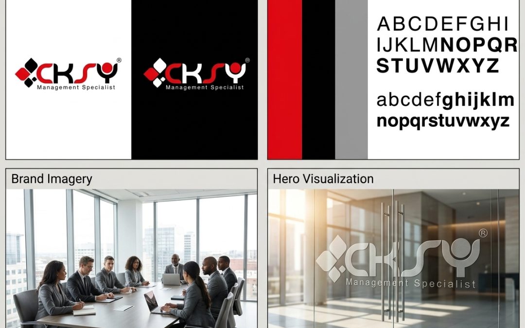
Color Accuracy: Defining exact CMYK, RGB, and HEX values ensures corporate red, slate gray, and solid black reproduce identically across offset printing, vehicle wraps, and mobile screens.
Typographic Hierarchy: Specifying bold, geometric sans-serif typefaces for headings and clean, highly legible weights for body copy ensures readability across both printed annual reports and web interfaces.
2. Physical Presence: Signage & Corporate CollateralYour physical presence is often a prospect’s first real-world interaction with your organization:
Signboard & Architectural Applications: Whether utilizing 3D embossed alphabet metal signage, backlit lightboxes, or minimalist frosted decals on boardroom glass, exterior and interior signage must faithfully reflect the geometry and spacing of your approved emblem.
High-Impact Print Assets: Corporate folders, saddle-stitched company profiles, and premium-finish business cards serve as tangible proof of organizational professionalism during client meetings.
3. Digital Alignment: Web Architecture & Online MediaEvery digital impression should instantly look and feel like an extension of your physical office:
Website Experience: Modern information and e-commerce websites must adopt your defined brand palette, responsive layouts, and intuitive conversion funnels.
Campaign Consistency: Google Display ads, social media feeds, and promotional videos should incorporate standardized lower-thirds, brand colors, and typefaces to reinforce brand recall.
